#geography #R
I made a GIF with ggplot2 and rworldmap
Published Apr 15, 2017 by Alik Ulmasov
In my last post, I mentioned that I was interested in exploring the mapping capabilities of ggplot2.
Well, shortly after I wrote that, I was searching the internet for “ggplot2 animated gif”, and I stumbled across this excellent walkthrough by Rafael Periera, which he had posted just minutes earlier! His blog, Urban Demographics is coincidentally already one of my favorites.
I wanted to make an animated map of world population density (such as this one on Wikipedia).
Using data from the World Bank, I was able to make this GIF with only a modicum of code (on GitHub here).
Here is the final product:
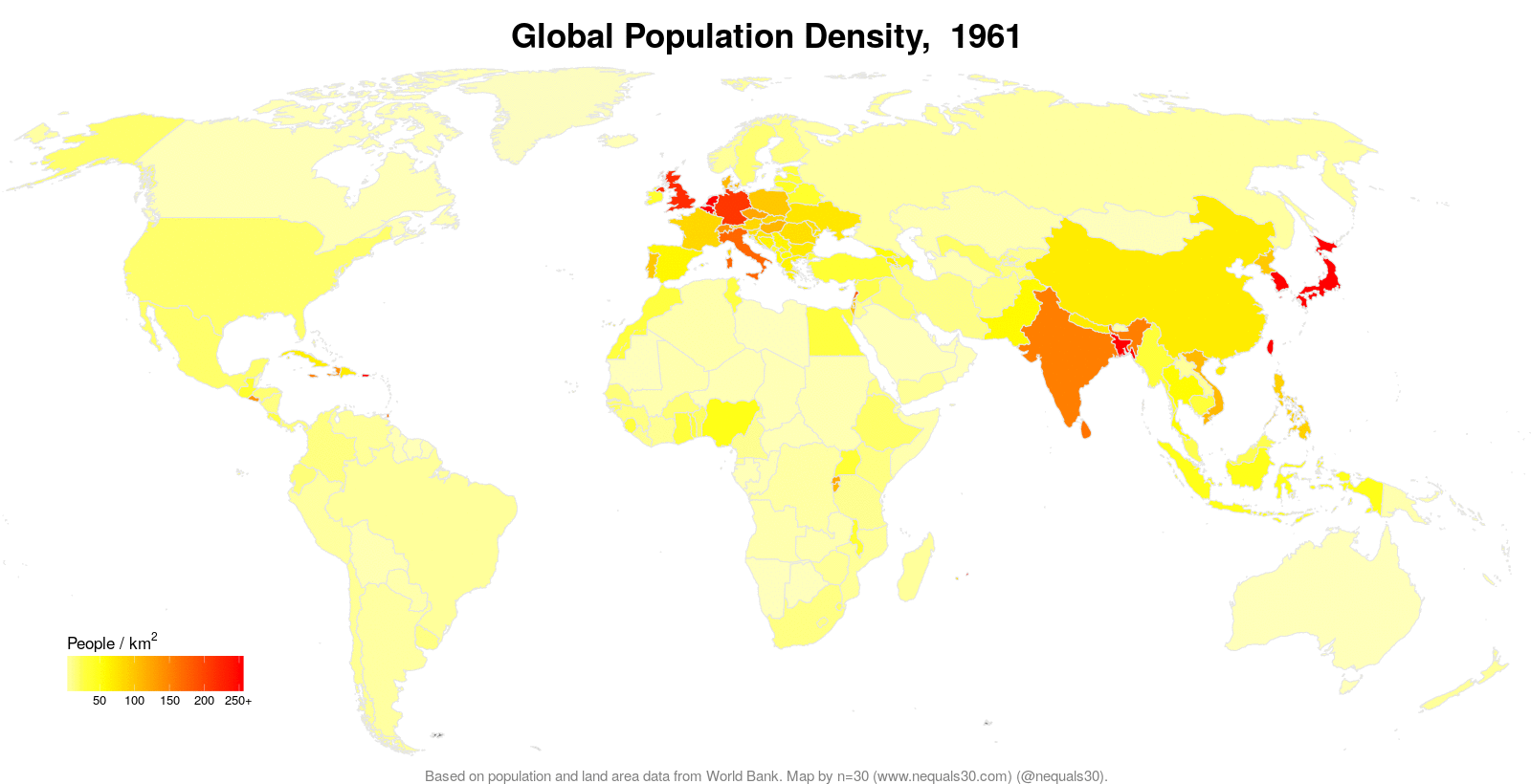
So… Maybe the change in the population density over the last 50 years isn’t that exciting. Mostly countries population density hasn’t significantly changed (with the exception of a few outliers such as Nigeria, Uganda, and Pakistan). The density measure is the population divided by the land area, both stats from the World Bank. I tried to write the code in such a way that I will be able to easily expand it to other country-based data later.
© 2024 Alik Ulmasov